I led the redesign of Al Jazeera’s mobile app, one of the world’s leading news organizations covering international politics. I worked closely with developers, product managers, editorial teams, and other designers on this project. This page is focused on research, wireframes, prototyping, and user testing, which I oversaw in the project.
Previous Al Jazeera Apps
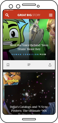
Prior to this redesign, Al Jazeera had four different legacy apps, one for each language and platform. Each App had a different, and sometimes broken, user experience. I began by conducting a design audit of the legacy apps. This allowed a deeper understanding of the content which the new app will be designed for, in addition to understanding what UX was already working for that content and what wasn’t.
Design Goals
Setting the project’s UX goals came about from conversations conducted between designers, managers, the editorial team, and developers. Based on these conversations, the two main goals for the project were:
1- Create an app that fully utilizes the affordances of mobile devices to increase engagement and loyalty towards Al Jaeera’s content.
2- Provide a unified experience for Al Jazeera’s users, and reduce the amount of maintenance previously demanded by the legacy apps
Target Audience and User Personas
Our target audience and user personas are influenced mainly by two things: the nature of the app’s international news content, and the mobile platform used to deliver it. The first segment of the app’s target audience is millennials, with a focus on older millennials.

Since Al Jazeera’s content is available in English, Arabic, Bosnian, and Mandarin Chinese, another target audience segment is multilingual users who speak any combination of these languages.
Users who have other mobile news apps are also a significant segment of the app’s target audience, since consuming news on their mobile devices is a regular practice for them.

This also extends to users who get their news from social media apps, an exponentially growing segment.
Comparative Analysis
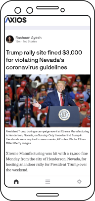
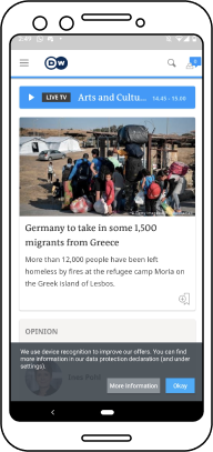
Based on the project’s design goals and target audiences, a number of case studies were selected to examine UX design for similar content across the market. The focus was mainly on news and social media apps. This included Axios, Politico, New York Times, Washington Post, Huffington Post, BBC Facebook, Instagram, and YouTube.
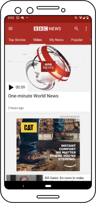
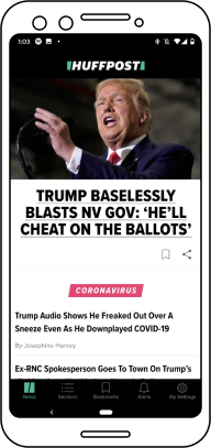
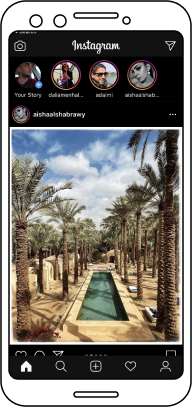
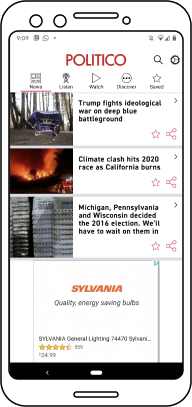
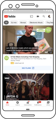
Some of what was studied in these apps included app structure, navigation, article display, media display and controls, and general interactive language. Findings from these case studies, along with the project’s design goals and target audience all played a key role in designing the wireframes, covered below.
Wireframes
NEws Articles and Videos
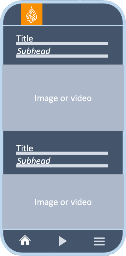
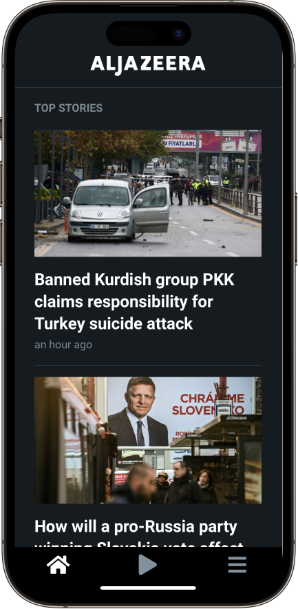
One of the main features of the new app differentiating it from the legacy apps is a feed based UX. This borrows some of the interactive language of social media, which facilitates users spending more time in the app and getting more engaged with its content.
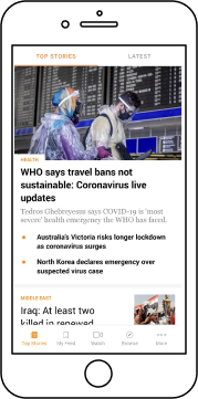
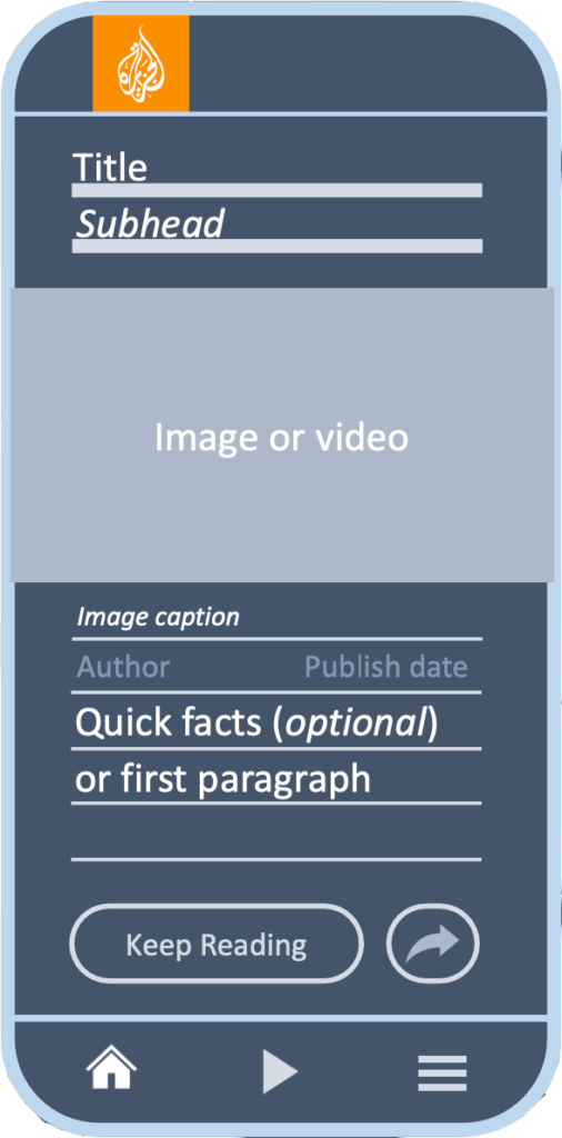
The main part of the screen displays an infinite stack of article cards, each containing its article’s title and featured image. At the bottom of the screen sits the app’s navigation bar, containing three tabs: home, video, and sections. Tapping on a card expands it, showing the entire article within the feed.
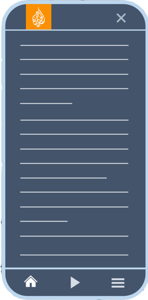
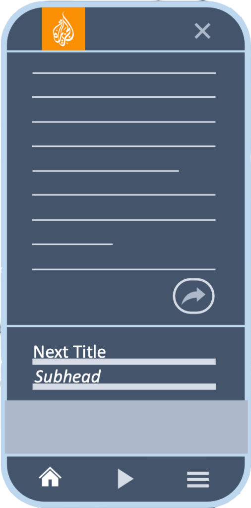
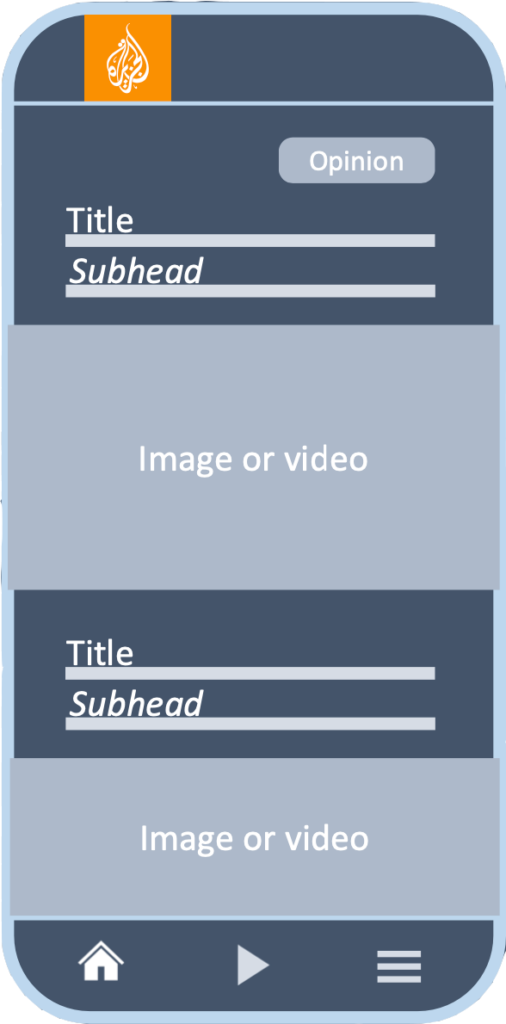
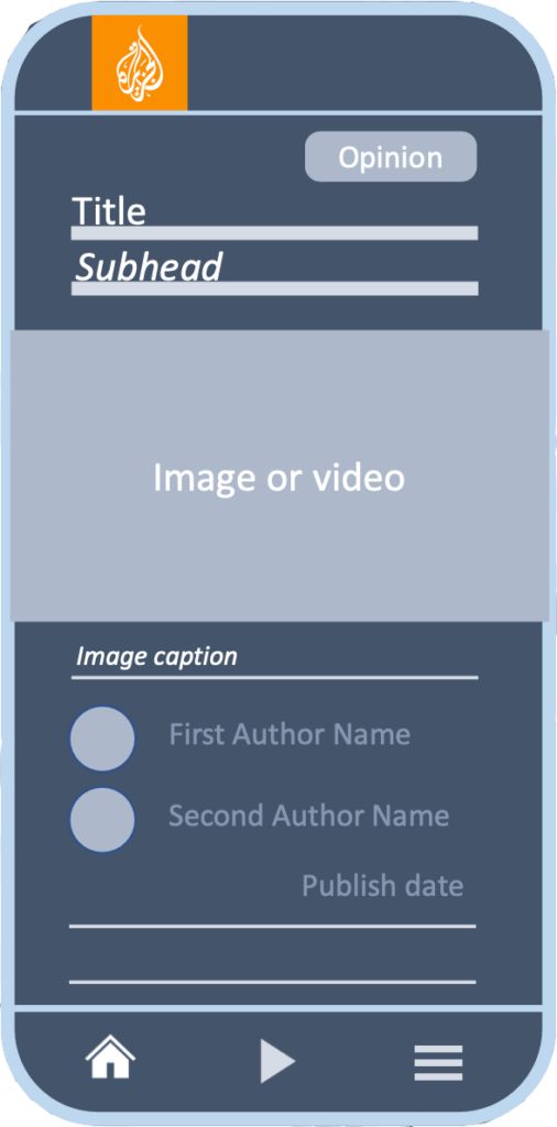
A user can either collapse the article back into a card or keep it expanded, in either case, the user is able to scroll down to the next article in the feed, or up to the previous one. Opinion articles are differentiated from other cards on the feed, and have their authors displayed prominently when the article is expanded.
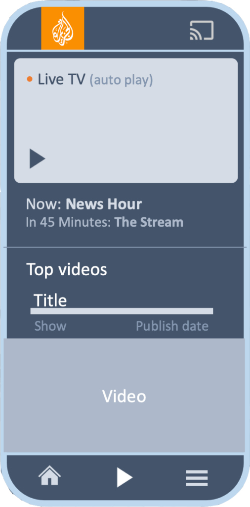
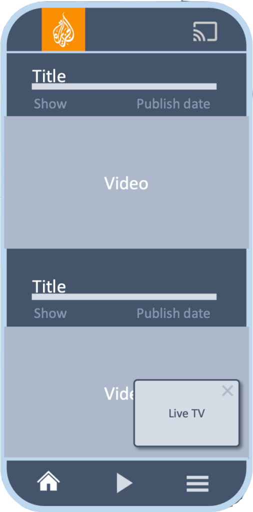
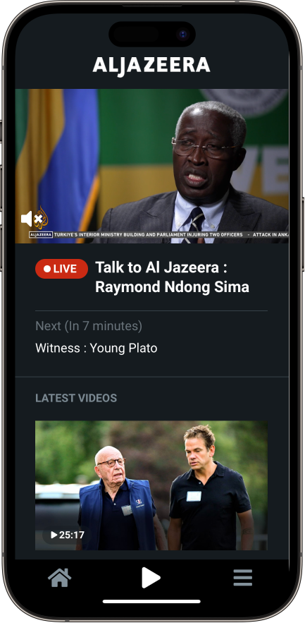
If the video tab at the bottom of the screen is tapped, the top of the screen will play Al Jazeera’s livestream video. It is followed by a stack of the latest show episodes and video news reports available on Al Jazeera. If either the livestream or one of the other videos is still playing while the user navigates away from it, the video continues playing on a floating mini-player.
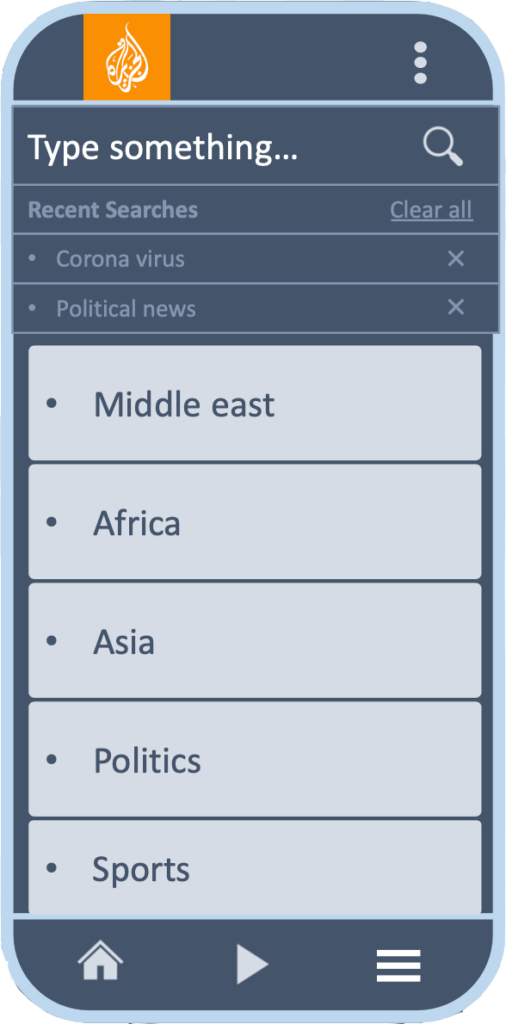
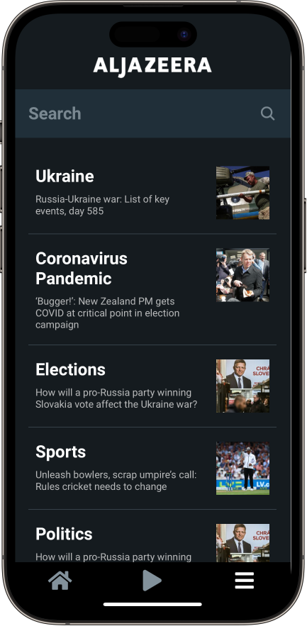
Tapping on the sections tab on the bottom right corner opens the sections screen. At the top of that screen a search bar allows the users to search for articles and videos. It is followed by a list of topics and regions that can be used to browse content in a more deliberate manner. Tapping on any of these sections will display an article card feed, similar to the homepage, with content dedicated to the topic or region selected.
These wireframes encapsulate the core interactive language of the app. Some alterations were made during the prototyping and user testing phase of the app, discussed in detail further below.
Audio and podcasts
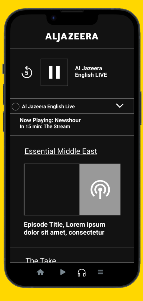
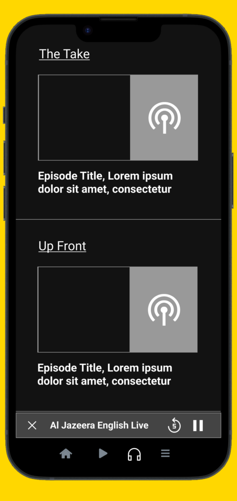
This set of wireframes expands the app’s core experience to include Al Jazeera’s Podcasts and audio content. It functions as its own separate tab at the bottom navigation bar. Similar to the video tab discussed above, the top of the screen in this section is reserved for the audio livestream.
The audio livestream is followed by a stack of the latest episode for each one of Al Jazeera’s podcasts. If the user scrolls away from the livestream while it’s playing, a mini player continues to play the audio at the bottom of the screen.
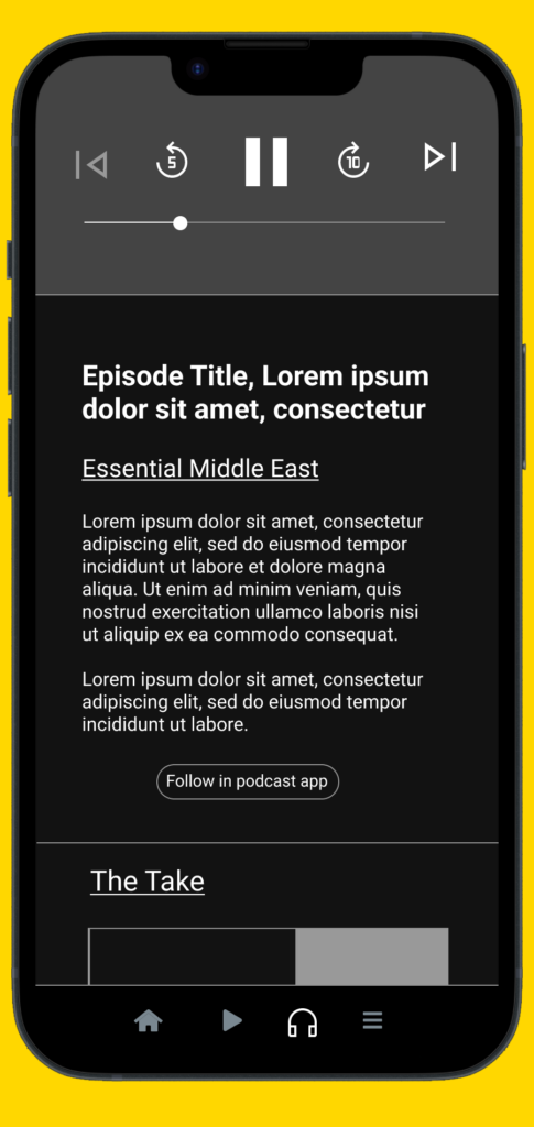
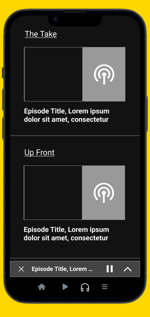
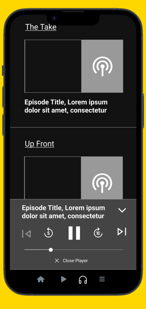
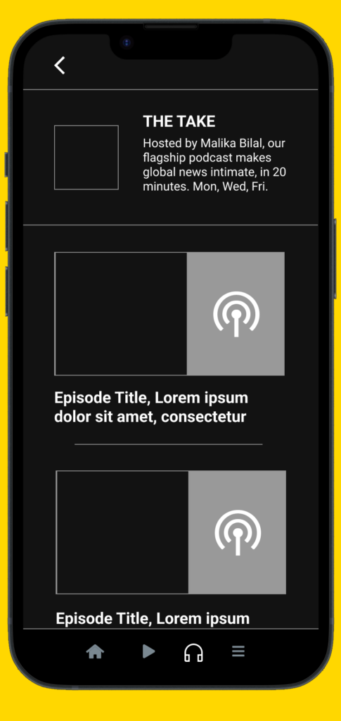
Tapping one of the podcast episode cards expands it into a player with audio controls, followed by the show name and text description. If the user scrolls away from an episode while it’s playing, it continues playing on a mini player at the bottom of the screen which can expand to show full audio controls. Tapping on the show name will display a list of all episodes in the show.
Results
These wireframes were translated into a series of interactive prototypes. The purpose of these prototypes was to ask UX questions such as: How does a user navigate within the app? Can a user open and collapse an article? Does the user recognize that they are still in the feed and not a new article page? How does the user interact with videos? What are the engaging and enjoyable parts of the app?
These questions were answered through three sets of user tests, which ultimately led to a better understanding of the app’s UX. This resulted in design iterations that delivered a far more engaging and fulfilling user experience.
Each set of user tests consisted of 5 to 10 users and divided into three segments:
1- Open exploration, to identify both rewarding and challenging interactions that users gravitate towards.
2- Specific scenarios that involved asking the testers questions such as: Can you open and close an article? Can you go to the video section and explain what you see?
3- Interviews with the testers to gain more insight into their thoughts and experience using the app.
These tests allowed us to recognize certain behavior patterns when it came to the app. It told us where the UX was broken and needed fixing before fully committing the resources to develop the app and deliver it to the public.
The end result was saw a significant increase in the app store ratings, where users doubled the amount of time spent in the app, where the user experience was unified, and maintenance was much more manageable. In short it achieved all of the goals that were set for it. The app also received an honorable mention and two nominations from the Webby awards, and was a nominee for UX design awards by the International Design Center Berlin .