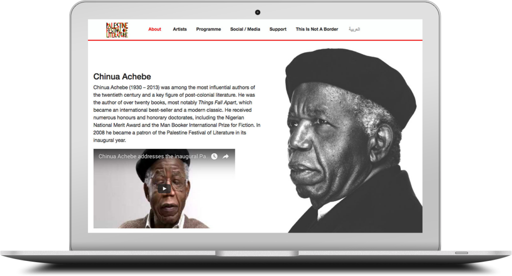
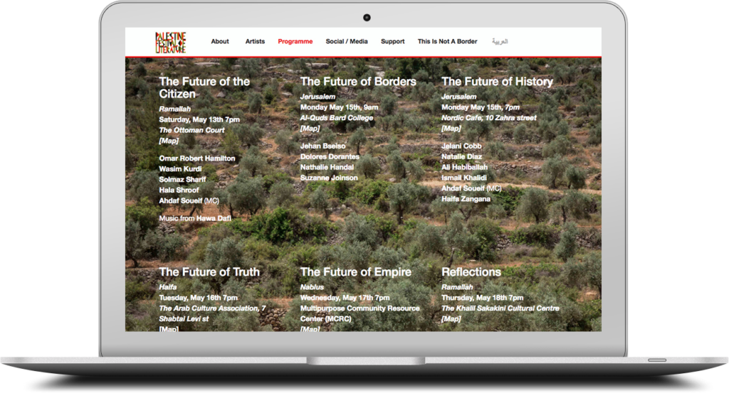
This page covers the work I did for the Palestine Festival of Literature (PalFest) website. The project had two target audiences: In-person festival attendees in Palestine, and an international audience interested in the fesival but unable to attend in-person. Below are some of the responsive wireframes designed for the project.
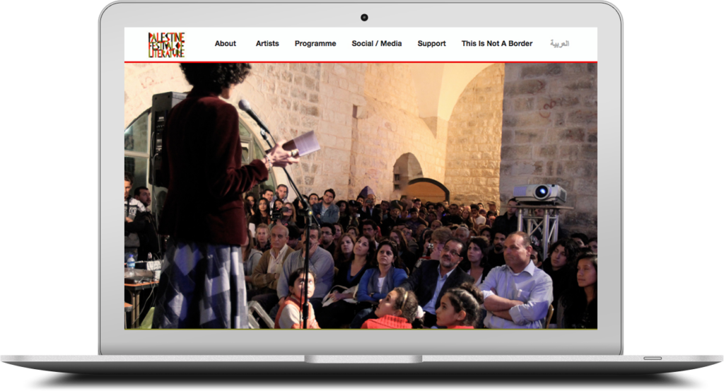
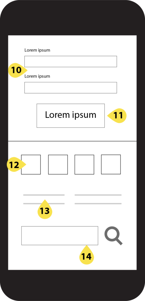
Homepage
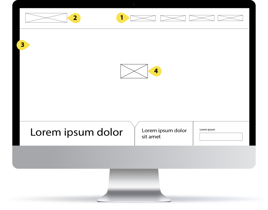
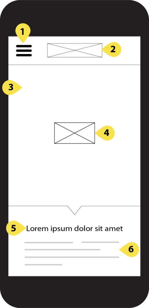
The homepage features a large cover image / video and a call to action (registering for the festival) followed by three different segments encapsulating the site’s main functions. They include: A featured article or essay card, which links to the full article / essay, a featured author or board member card,which links to a page showing all of the board members and participating authors, and a signup form for the festival’s newsletter. These are followed by the site’s footer.
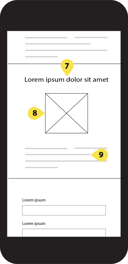
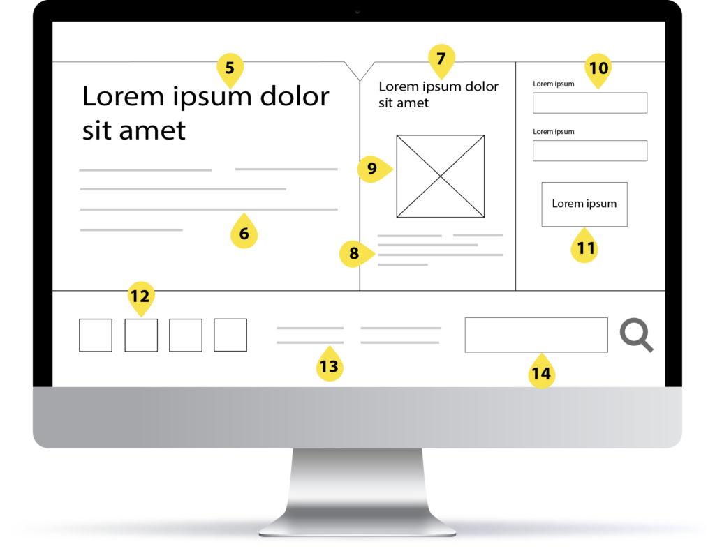
Below is a detailed list of all of the elements in the homepage wireframes:
1.Site navigation
2. Site logo / link to homepage
3.Cover image / Video
4.Call action (register for festival)
5.Feature article / essay title
6.Feature article / essay summary
7.Feature author / board member name
8.Feature author / board member image
9.Feature author / board member summary
10.Newsletter subscription form
11.Newsletter subscription button
12.Links to social media accounts
13.Footer navigation
14.Search bar
Article
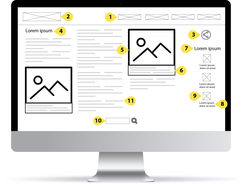
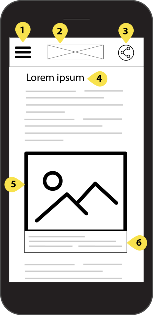
The responsive wireframes for the article / essay pages show three columns of content for desktop, which are transformed into one column for mobile. Secondary interactions include related articles / essays, and a link to share the page on social media.
Below is a detailed list of all of the elements in the article page wireframes:
1. Site navigation
2. Site logo / link to homepage
3. Share link / social media
4. Article / essay title
5. Article image
6. Image caption
7. Title for related articles / essays
8. Related article / essay title
9. Related article / essay thumbnail image
10. Search bar
11. Article text.
Media Gallery
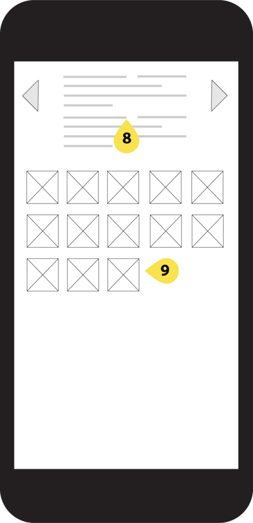
The media gallery is dedicated to photos and videos of the different events, lectures, readings, and performances at the festival. Below is a detailed list of all of the elements in the media gallery page wireframes:
1. Site navigation
2. Site logo / link to homepage
3. Share link / social media
4. Image / video title
5. Image / video
6. Previous Image / vdieo
7. Next Image / video
8. Image / video description
9. Image / video thumbnail
Results
The 2016 festival year website launched successfully on time. The event hosted hundreds of preeminent writers and editors, who used the website during the course of the festival.
PalFest’s budget was cut before we were able to further develop the website to incorporate everything detailed in the wireframes above. However, these wireframes stand as an example for my mobile-first responsive design practice, which I built on for my work with Al Jazeera.